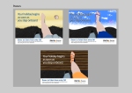
Week Twelve
These are the final mount ups that I sent off to YCN including the rationale
Week Twelve
These are the final mount ups that I sent off to YCN including the rationale


Week Twelve
These are the final images which I sent off to YCN including the rationale


Week Eleven
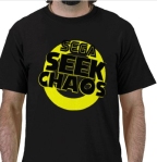
These are the two main components that are included in the console specific merchandise bags. A DS sticker and an Xbox 360 Face Plate. The face plate couldn’t be the same as the Xbox design itself because it would just be simply black and red with nothing else so I added the Seek Chaos design to it as well.

Week Eleven
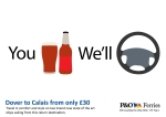
I couldn’t sleep for ages the other day because I got this idea stuck in my head, my mum gave me the idea saying about the “you drink we’ll drive” instead of the don’t drink and dive adverts. So I ended up thinking of other things passengers could do while the staff work. So I thought about the passenger being able to eat, while the staff navigate – though I wish I had left the map out of this one and only included the compass. How the passenger can sleep without worrying about overlaying because they do an announcement at 6am so everyone gets up and how the passenger can relax and have breakfast and have a cup of tea while the captain parks the ship into the dock. I plan to enter this into the competition as well.


Week Eleven
Again a very simple design just using the poster designs to link everything together, just using the same 3 colours as well.


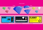
Week Eleven
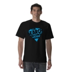
These are a few of the free merchandise that is given away, very simple, I just used the images from the posters to create these.


Week Ten
These are the designs for the new website. I decided that while I had the chance to re-design it I thought I’d show it in a way that the hunt could be more interactive. The Emeralds and Rings would now be released around specific towns – i chose London, Manchester, Sheffield and Edinburgh for the examples and clues would be released on the website to lead people to where the Emeralds and Rings are hidden. First page the user is invited to choose their location of choice, then to choose whether they want to go to the clues page, or go to the page to enter their code. I didn’t include the page to show the clues page as there is so many ways that this could be done and it would take a lot of work and planning that is not needed to get the idea across. So the next page is where they enter their code. At the bottom of the page is the key to the colours of the emeralds and characters that are unlocked with that colour.


Week Ten
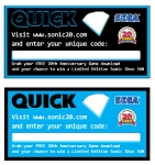
The tickets on the left are the tickets that come inside the Emeralds and the one on the right is the one that is attached to the Chaos Rings. I couldn’t originally decide what colour for the Emerald ticket so I tried one in Black and one in blue. I haven’t designed the back of the ticket that would show the Xbox that would be won in the competition because I haven’t designed the Xbox as of yet so that will be added later.

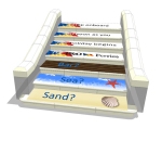
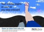
Week Ten
These are the posters I created for the P&O campaign. I was intending to do it in a photomanipulation that it would most likely be done if a real agency had created it, but when trying it just didn’t work. Trying to find a picture of sand from directly above, while it actually looking like sand so I decided to illustrate it on Photoshop instead and while these don’t look 100% professional they get tje idea across which is the main important thing.


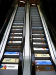
Week Nine
These are the second part of the P&O Campaign, placing images directly onto the things that that people actually step onto, escalators, steps and zebra crossings to help get the idea through and feel slightly interactive. The Idea of Sand Sea and Bar is taken from the well known holiday saying Sun Sea and Sand. I created 7 images as I believed that was enough as most zebra crossings are around 6 or 7 stripes and it is enough to be repeated on steps and escalators that won’t get missed on them.